
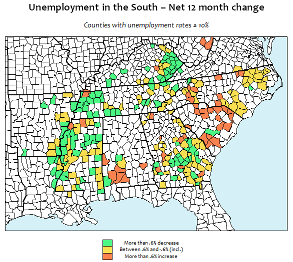
I'll admit that I'm a bit perplexed by this map. I dug through the 12 month unemployment data for the counties from last week's unemployment entry (those with unemployment equal to or greater than 10% as of May 2013). This new map shows the net change in unemployment rate from June 2012 to May 2013. As you can see, the results are mixed.
I can think of a few basic factors that may explain why the map looks the way it does:
These probably all factor in to some extent, though I can't claim to know which is most prominent. It would probably be useful to look at this data for the South as a region to draw more meaningful conclusions. I'll save that for another time. Feel free to add your own thoughts below.
Travis
I can think of a few basic factors that may explain why the map looks the way it does:
- JOB SEARCH FATIGUE - The numbers of people actively searching for labor are decreasing in some markets.
- REAL GROWTH - Though unemployment rates remain high in these locations, there is some sort of legitimate economic growth taking place. (In most places, it would still be something like 13.3% to 12.5%).
- MIGRATION - Workers are actively seeking employment in urban centers, decreasing the number of laborers actively searching for work in rural counties, thereby skewing the numbers.
These probably all factor in to some extent, though I can't claim to know which is most prominent. It would probably be useful to look at this data for the South as a region to draw more meaningful conclusions. I'll save that for another time. Feel free to add your own thoughts below.
Travis
 RSS Feed
