
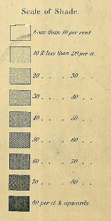
In 1861, this map was commissioned by the US Government. It was the first major effort to map population density in America. The following note is found at bottom left of the original document.
After careful examination of the above very interesting map I am prepared to state that it not only furnishes the evidences of great care in its execution, but can be relied on as corresponding with the official returns of the 8th census.
Joseph C. G. Kennedy, Superintendent
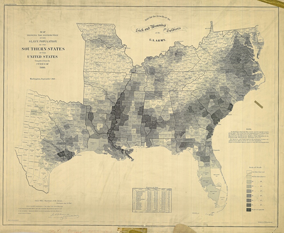 |  |
This visual had a greater purpose at the time, though. With the outbreak of the Civil War, the Bureau of the Census did not have the capacity to produce typical graphs and tabulations found in previous versions. In fact, a more formal report was not produced until 1864. Instead, Kennedy's United States Coast Survey took data from the Census and produced visualizations intended for military strategy. Though it may seem odd to us now, the Coast Survey at the time had become a "hub of mapmaking innovation," and was therefore perfectly suited for the task - paint the Civil War not as a states' rights' issue, but as the defense of a labor system that required black disenfranchisement to persist.
According to the present-day Census Bureau,
The map was created to understand the secession crisis, by providing a visual link between secession and slavery. The mapmakers consciously limited the map to just the Southern states, including the Border States of Maryland, Virginia, and Kentucky, but not the Western slave states of Nebraska, New Mexico, and Utah. During and after the war, the map then could be used by the Union to argue that the destruction of the Confederacy meant the destruction of slavery. There is a strong message in the banner at the top of the map that reads “For the Sick and Wounded Soldiers of the U.S. Army.”
According to artist Francis Bicknell Carpenter, this map was frequently consulted by President Abraham Lincoln in considering the relationship between emancipation and military strategy. Carpenter took up residence at the White House in February 1864 to paint President Lincoln, after he was inspired by Lincoln’s Emancipation Proclamation. Carpenter wrote that Lincoln would look at the map and send his armies to free blacks in some of the highest density areas in order to destabilize Southern order.
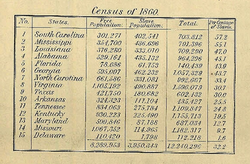
Over half of residents in Mississippi and South Carolina were enslaved in 1860.
I've been fascinated by this map for over a year now, and I've finally figured out why. It bears a striking resemblance to the two maps below.
| Total Direct Payments (Fed. Ag. Subsidies), 2009, or "How Much Money Does the Federal Government Directly Pay out to Farmers, by County?" 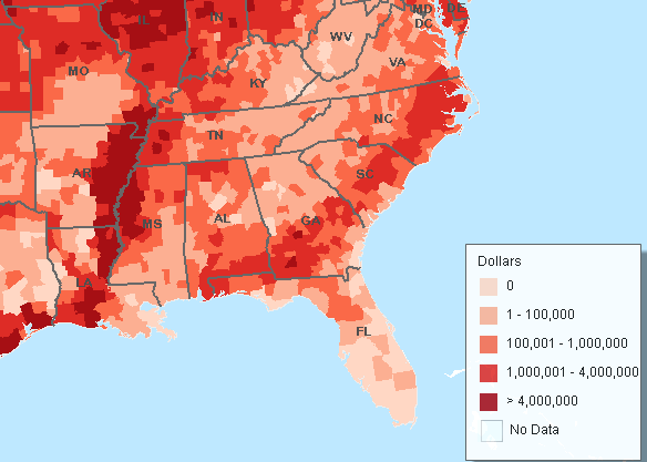 | Poverty Rates by County: 2012, or "What Percentage of Residents Live Below the Poverty Line Established for Their Household Type?" 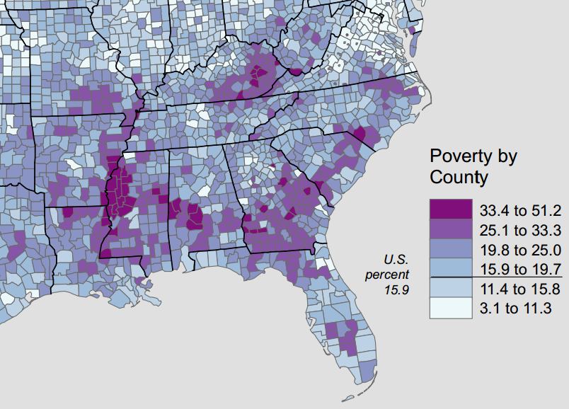 |
It would be foolish to call the correlation direct. The overlap isn't perfect and the flow of money obviously complex. But three reasonable assumptions emerge:
- Pay no attention to the gradual upswing in our economy. In the rural South, the economic and social legacy of slavery persists and will persist barring intervention of some sort.
- Whether intended or not, current federal monies tend to follow old lines of white privilege and power. (The existence of Medicare and Medicaid notwithstanding - the amount doled out per person is beyond comparison.)
- New economic models that do not prioritize external government investment over all else are needed. Communities must band together to generate wealth in new ways.

The home of African-American tenant farmers in Louisiana. (Photo: Marion Post Wolcott, 1940), via The Grio.
I'll admit, being a farmer can still be tough; but is it as tough as surviving on $22,000 a year as a family of 4? Not a chance. Even in a terrible year, farmers have safety nets that the poor can only dream of.
The cruelest twist is that many of the poor, black families who worked on Southern plantations for generations and who did not or could not move away now lack the type of landholdings that would help them qualify for these sorts of subsidies in the first place and the type of access to significant capital required to create an ag business. What's more, these lands are increasingly farmed by corporations, putting them another length beyond the grasp of locals. Under an evolved heading, the disenfranchisement of poor, black Southerners continues.
As an industry, agriculture built almost every town in every county with the highest level poverty on the map above (outside of Kentucky), but it won't be what brings them back.
==============================================
You can find Greenfield Southeast on Facebook here.
 RSS Feed
